
Objective
Redesign the app to enhance user engagement, improve usability, and streamline the booking process. Focus on visualizing the app’s advantages, optimizing call-to-action navigation for efficiency, and making the fare comparison section more user-centered to accelerate user decision-making.

“When I first opened the app, I enjoyed the color contrast of the yellow text on a blue background, which made the information stand out. However, the initial window displayed a board with icons
that lacked visual appeal, so I quickly skipped all the introductory windows and went straight to the homepage. I also ignored the ‘view example’ button, assuming I would figure it out later.”
Nancy (female, 26, single, works in a science lab at UIC)
Overview
Southwest Airlines is well known for:
Offering competitive fares
Transparency with no hidden fees
Unique boarding system that has no assigned seat (first-come, first-served)

Primary Research
“When I first opened the app, I enjoyed the color contrast of the yellow text on a blue background, which made the information stand out. However, the initial window displayed a board with icons
that lacked visual appeal, so I quickly skipped all the introductory windows and went straight to the homepage. I also ignored the ‘view example’ button, assuming I would figure it out later.”
Nancy (female, 26, single, works in a science lab at UIC)

Secondary Research
Southwest Airlines is known for offering premium
flight services at affordable prices. According to the ACSI Travel Study (2022-2023), Southwest ranked 3rd in customer satisfaction, demonstrating its ability to meet the needs of travelers. The airline primarily targets families, leisure travelers, and business travelers who rely on frequent, low-cost flights within the U.S. However, as highlighted by Nina Sheridan from Latterly, one of Southwest’s brand objectives in 2023-2023 is to increase its business customer base. Unfortunately, the current app design has not effectively catered to this segment. For instance, the booking process prominently features only the ‘Wanna Get Away’ fare, offering less value to business travelers who need to compare all available fare options at first glance quickly.


Challenge
The primary challenges include a lack of visual appeal and poor user engagement. Additionally, the navigation bar is not optimized for new users, making it time-consuming for them to locate essential features. Lastly, the booking site is ineffective for business travelers as the site does not provide a comprehensive view of available options. This inefficiency contributes to lower user satisfaction, particularly among a demographic that requires quick and easy access to fare comparisons.
Solution
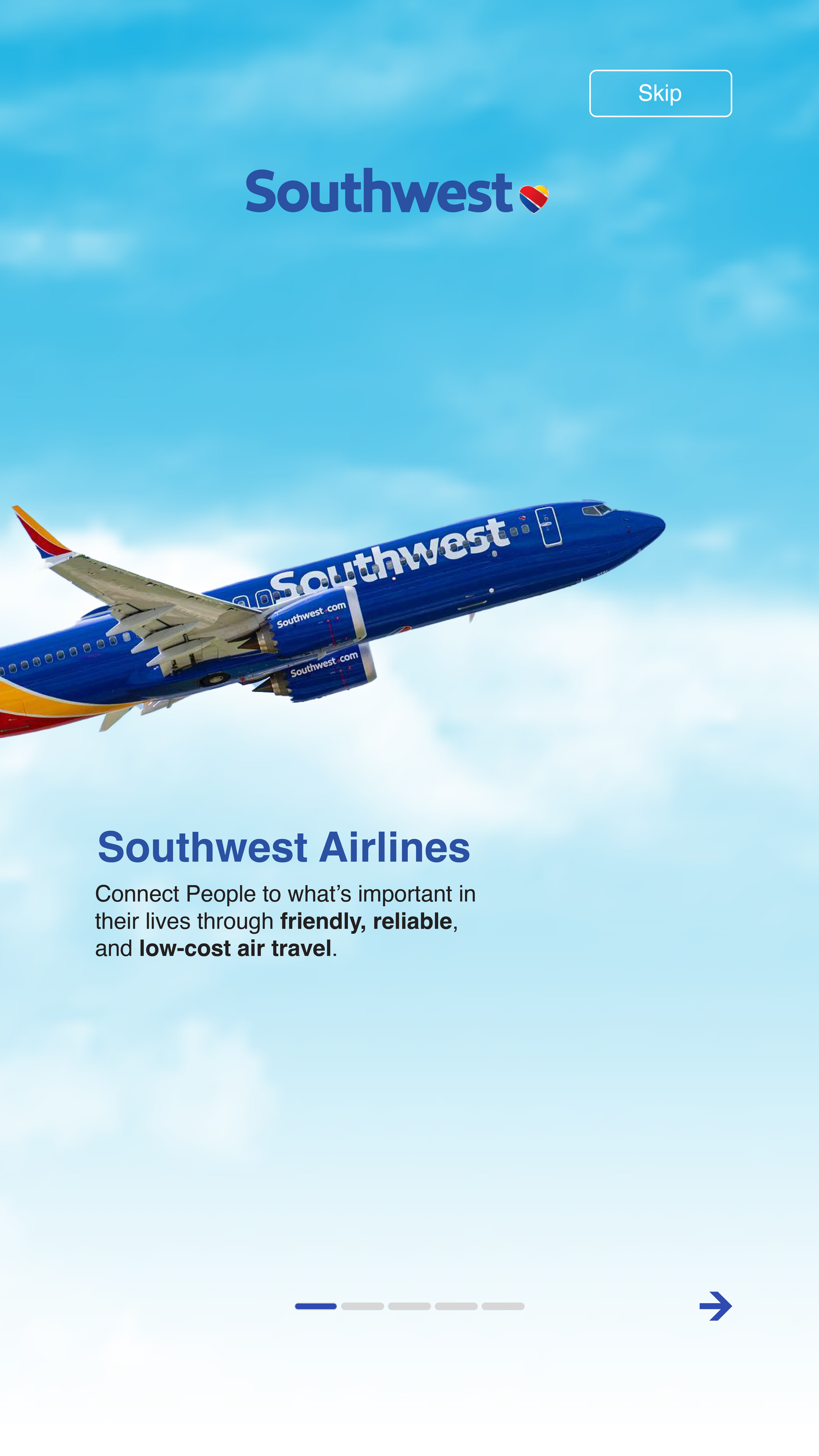
Improve First-time user onboarding
The onboarding process, which currently features text and icons, could be made more engaging by incorporating an image slider. This slider would preview the app’s key advantages and features in detail, providing a more dynamic and visually appealing experience without requiring additional actions from the user. This approach would make the onboarding feel smoother and more informative while maintaining user interest.
Reorganize the navigation bar
Although the “Book Flight” button is one of several navigation options, it is one of the most crucial features of an airline app. Placing the “Book Flight” button in the center would enhance its visibility, giving it more prominence and making it easier for users to find. Additionally, aligning the button with the natural flow
of the eye would improve interface scanning speed.
Optimize the booking flow
The app currently displays only the lowest price, and customers need to navigate to a different page to view all available prices. Additionally, the prices are aligned vertically, which slows down the comparison process. This can be improved by displaying the
full range of prices on the same page with just one click. Furthermore, organizing the prices horizontally would enhance the user’s ability to compare options. As Anthony from UXmovement notes, horizontal arrangement emphasizes the relationship between different actions, encouraging users to consider all options equally. This redesign would optimize the scanning flow.
Design

“Apps in similar niches tend to look and work in familiar ways (project management apps, for example), so if your users are more knowledgeable, they probably won’t need to go through the entire process similar to a complete beginner. This is why it’s always a good idea to add a skip button during the different stages and allow users to control the process based on their preferences. ”
Burt, R. (2024, September 3). 10 app onboarding best practices for higher retention. Gravatar Blog. (link)
“Consistency in Design: Maintain a consistent design language between the onboarding screens and the home page to avoid any visual jarring.”
Sorathiya, N., & Sisara, A. (2025, April 3). The ultimate guide to Flutter onboarding slides. DhiWise. (link)


Design Process
User onboarding
Research
“An effective visual design has to use the right visual cues to show the users what they want, trigger a gut reaction, and engage with them.”
UserFacet. (2022, January 5). Principles and elements of visual design that impact user experience. (link)
“Instead of giving new users a wall of text to read, make the onboarding engaging – give them something to focus on.”
Hayes, A. (2024, January 10). Mobile app onboarding: 10 tips (and examples) for 2024. Wyzowl. (link)
“As soon as a new user downloads your app, your value proposition should be front and centre – reminding them of why they downloaded in the first place and reassuring them of what you can offer.”
Hayes, A. (2024, January 10). Mobile app onboarding: 10 tips (and examples) for 2024. Wyzowl. (link)
Wireframe
Design

Booking Browsing
Research
Single-page design eliminates distractions while increasing leads and sales by keeping users on a single page.
Burch, N. (n.d.). 8 CSS & JavaScript snippets for creating onboarding carousels. Speckyboy. Retrieved November 19, 2025, (link)
The Toluna survey showed that 56% said their key reason for booking online was to find lower prices
Hapy Design. (2024). Role of visual design in user experience. (link)
Wireframe

Supports users completing tasks effectively, as the finding shows users experience difficulties completing tasks but proceed in order to get competitive prices.
Sharma, D. (n.d.). Mobile app onboarding: How-to, best practices, and examples. Adapty. Retrieved November 19, 2025, (link)
Steve Krug said, "It doesn't matter how many times I have to click, as long as each click is a mindless, unambiguous choice."
Gupta, S. (2024, August 20). Onboarding screens examples and best practices for user engagement. Nudge. (link)
Navigation Bar Update
Research
Vertical scrolling is most common for reading articles, browsing feeds, or navigating linear content. With touchscreens, scrolling has become an intuitive gesture, making it a default interaction for users.
Burt, R. (2024, September 3). 10 app onboarding best practices for higher retention. Gravatar Blog. (link)
Research shows that 94% of users browse with their phones held vertically, making thumb-friendly design a crucial factor in driving conversions
Shivkumar, M. (2025, June 17). App onboarding: What is it + 12 best examples to learn from. CleverTap. (link)

Wireframe
Mobile research has demonstrated that vertical scrolling is much easier for users than horizontal scrolling. If you consider physical ergonomics, it's much easier to move a finger up and down than it is left to right.
Balus, M. (n.d.). The fundamentals of visual design and why you need it. The Good. Retrieved November 19, 2025, (link)
Design

Key Updates Feature
The booking icon has been strategically centered to create a seamless transition for customers, guiding them effortlessly from flight discovery to booking.
The introduction section now features enhanced illustrations and a visually appealing UI, immediately highlighting the latest updates to the mobile app. For added convenience, users have the option to skip this section entirely, allowing them to access the homepage without delay.


The booking process was streamlined into a single, user-friendly interface, empowering customers to effortlessly compare prices across multiple flights while exploring the detailed benefits of each fare option—all in one place.

Conclusion
This project successfully tackled critical usability challenges, creating a more engaging user experience for the Southwest Airlines app.
By enhancing onboarding, reorganizing navigation, and streamlining the booking process, the redesign not only simplifies user interactions but also caters to diverse customer needs, including leisure and business travelers.
The updates align with the airline’s goals of transparency and customer-centricity, ensuring users can make informed decisions quickly and efficiently. Although this solution marks a significant step toward optimizing the app experience, it remains untested in a live environment. Future iterations will be guided by real-world user feedback and data insights, ensuring continuous improvement and alignment with user expectations.